Please visit my new lighting design website at the following link!
https://lookingatlight.weebly.com/
The use of color is one of the most noticeable defining elements of any lighting design. For many designers, color is the most personal of elements, and often times not only defines the design, but the personal style of the designer. Some designers prefer a very saturated palette, with deep reds and purples. Other designers are able to harness the subtlety of white light in such a way that tints gently pull the audience along the path of the storytelling. As a beginning designer, you may be overwhelmed by the sheer number of choices in color, and are not really sure exactly how or why to choose one shade of blue than another that seems almost the same. But as you experiment and understand more fully how color can affect the storytelling, it will become an invaluable partner in your design work.
I have written a whole page about Color Theory that has a bit of the science behind color choice
I have written a whole page about Color Theory that has a bit of the science behind color choice
hue
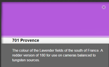 from www.leefilters.com
As discussed briefly in the color theory section of this website, color is really a function of two factors: Hue and Saturation. Hue can be described essentially by asking 'what color is it'? The answer might be simple, like 'blue' or 'red', or it might be more descriptive like 'blue, but kind of pushing towards green', 'really ugly yellow', or 'musical theatre fuchsia'. Each of the color manufacturers name the colors that they create based on the hue of the gel. Some of them have interesting stories behind them. One of the most popular colors in the history of lighting gel is Rosco 02, "Bastard Amber". The story behind the creation of this gel (as I've heard it) goes like this: Way back in the day, the lighting company that became Rosco was working through the chemistry to create an amber tint gel. But when the batch came out, it was much pinker than they had originally intended, so they tossed the whole lot into the garbage. An electrician rescued a sheet, experimented with it and found that it was very pleasant on skin tones, so wanted more. With a little reverse engineering, the chemists at Rosco were able to reproduce the gel color, which is not really pink and not really amber, hence 'Bastard Amber'.
A side note here- While R02 is a go-to color for many designers, I tend to recommend against it, and almost never use it in my own designs. It is true that it is very pleasant on Caucasian skin tones, I find that it is not as pleasant on darker skin tones. Perhaps more importantly, it tends to suck the vibrancy out of the colors of costumes and scenery. I know of at least one instance of a very good lighting designer who was basically blacklisted from a company by the costume designer because of R02.
Apollo has begun manufacturing color, and as a way to present the company's 'fun-loving' attitude, many of their colors have cute names. They also make a 'kinda pink, but kinda amber' color similar to Rosco 02, but they call it "Fatherless Amber". Another fun Apollo color name is a gel that looks like a lavender gel, but when you put it into a light, it would be better described as pink. Therefore, they've named it "Not What You Pink".
The names behind the colors are fun, but they can also be dangerous. You might be looking for a blue to help you light the cyc to look like the sky. So by looking at the names of the colors, you might choose R67 (Light Sky Blue) or R68 (Parry Sky Blue). A better way to choose color, however, is to look through (not at) the actual gel swatches, shine light through them, and see what they do to the light. You might find that in the color palette of your production that R67 and R68 are too green (often my experience with these particular colors) and that the redder Gam 848 (Bonus Blue) may be a better choice.
Another caution here: Each of these manufacturers has their color catalog online, with color chips that approximate the color of the gel, as well as all of the additional photometric data about the color. While this is a convenient resource, it is no substitute for having an actual gel swatch in front of you. With the online version, there is no way to look at what light does when it passes through the gel, and choosing color based on an online chip will ultimately lead you to disappointment more often than not. Choose the color that helps you tell the story. Not the one that the manufacturer tells you will work best in that scene, and not Apollo 3000 just because it's called "Simply Mauvelous".
Whatever colors you choose for your design, it is important to keep a couple of things in mind. First, make sure that your colors work together as a whole. Painters will mix a handful of colors when preparing for a painting, and for the most part, create the painting using those colors, or mixes/shades of those colors. They place the colors on a board called a palette, and this is where we get the term 'color palette'. Lighting is the same: choose a constrained palette of colors that work together for the story that you are helping to tell. Throwing color at the canvas just to throw color is rarely the way to go. This 'tutti-frutti throw up' method tends to just create a gobbledy-gook of slop that does not serve the play. Choose your color carefully.
Another thing to keep in mind is that color is easy to change. Despite years of experience and immense artistry, professional designers often get into tech to discover that a color is acting unexpectedly with the rest of the palette, with costume or scenery colors, or with the actors on stage. It is relatively easy and cheap to change out a system of color for another midstream in technical rehearsals when something is not working the way that you expected it to. Changing out all of the color every day on every show is not the way to go, but especially as a young designer while you are gaining experience, you should keep this in mind as you make discoveries in full scale on stage during tech.
Saturation
One of the most important factors in color choice is that of saturation. More saturated colors are the ones that 'look more like color', or are 'darker colors'. Less saturated colors, or tints, are colors that 'push' white light in one direction or another. Color temperature differences (cool to warm) are also related to this concept of tinting.
While there are not really any rules here, in general more 'presentational' productions are the ones that often benefit from more saturated colored light, while more naturalistic productions tend to lean more towards tints. Also, the environmental color palette may be more saturated than the area palette used for lighting actors.
This all being said, your color choices must be carefully tied both to the text of the play that you are designing, and to the conceptual style that has been worked out by the artistic team. Sometimes even highly naturalistic plays and environments benefit from a more saturated color palette, and many an avant-garde highly conceptual production has been successfully lit with shades of white light.
This all being said, your color choices must be carefully tied both to the text of the play that you are designing, and to the conceptual style that has been worked out by the artistic team. Sometimes even highly naturalistic plays and environments benefit from a more saturated color palette, and many an avant-garde highly conceptual production has been successfully lit with shades of white light.
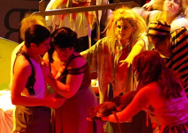
In many situations, saturated color is the preferred way to go. This shot from the climax of the highly stylized musical "Reefer Madness" reflects a surreal 'comic book' style reality. Saturated red front light, coupled with the stark yellow diagonal back light creates an unnatural world in which the attack of these reefer zombies makes perfect sense.
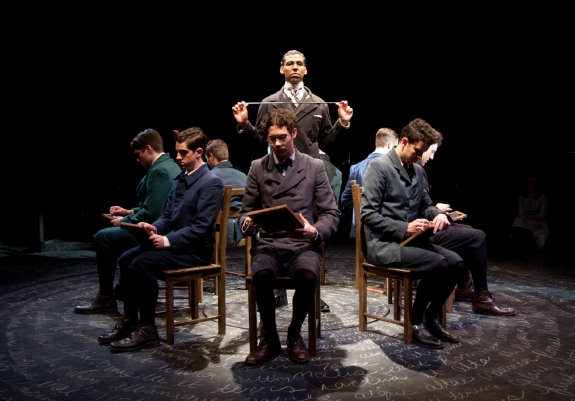
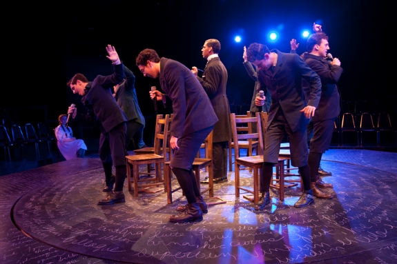
Some plays, on the other hand, require a subtler color palette. This scene from "Spring Awakening" in which students are trapped in the bland 'adult world' of the schoolhouse is lit with only white light.
|
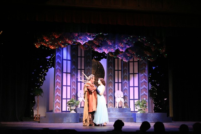
In many cases, a combination of saturated and unsaturated color is appropriate. In this photo from "Shakespeare in Hollywood", a saturated lavender creates an environment in which the lovers are placed- lit in tints in order to provide good visibility.
However, the way that this production was conceived, once the scene shifts from the 'adult world' into the inner monologue of the teens, color is used to transform the environment to reflect the inner complexity of these characters.
|
